Folk (Browser) Interfaces
For the past couple of years I've found myself returning to vanilla Javascript to build a variety of media interfaces. Ignoring the networked potential of the internet, I've felt liberated to simply point at local files and enjoy the multi-media power of the browser as rendering engine.
In this modality, one composes interfaces through browsers primitives—images, video, and text—interacted with primarily through event handlers. If one can consider this programming, it's primarily because one is still writing code. However, it deviates from traditional notions of programming: abstraction, composition, security, extensibility, or performance. The goal is not to produce a system that runs forever as has historically been the aim of software for the government and, subsequently, large tech behemoths.
Instead, it re-centers programming around designing powerful media interactions. This kind of interface design is intimately connected to the materiality of media and, consequently, banks on domain knowledge in, e.g., computer graphics. It's akin to building a one-off Photoshop or Blender interface, built on robust web APIs (canvas, audio, WebGL) and libraries (Three, p5, tf.js). Exceptionally, these libraries are focused a giving you handles into media, rather than supporting an industrial mode of production. The tradition in question can be drawn back through tools for artists such as Processing, Blender, Max/MSP, Quartz Composer, and TouchDesigner.
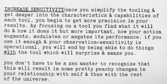
I think of these as folk interfaces, akin to the jigs one makes in wood-working. Divorced from grandiose ambitions of building comprehensive systems, it leads the programmer to directly engage with data. I hope this mode can paint the picture of software, not as a teleological instrument careening towards automation and ease, but as a medium for intimacy with the matter of our time (images, audio, video), yielding a sense of agency with what, to most, feels like an indelible substrate.
Seeing what's happening
This realization began with me making small visualizers for a variety of ML projects, before I had any theses on tool-making. The browser was a natural platform: thousands of lifetimes spent inside the techno-empires have made it very robust for media display. I also had prior experience with web development.
One system in question was a human-in-the-loop rotoscoping tool. Central to the design was legibility of the outputs to the user so that they could then be refined by hand. My goal was to gain intimacy with the inputs and outputs that the systems I was designing expected and produced, an intimacy that's impossible to reach without swimming in the data and absent when simply flicking through results in a file browser [1].
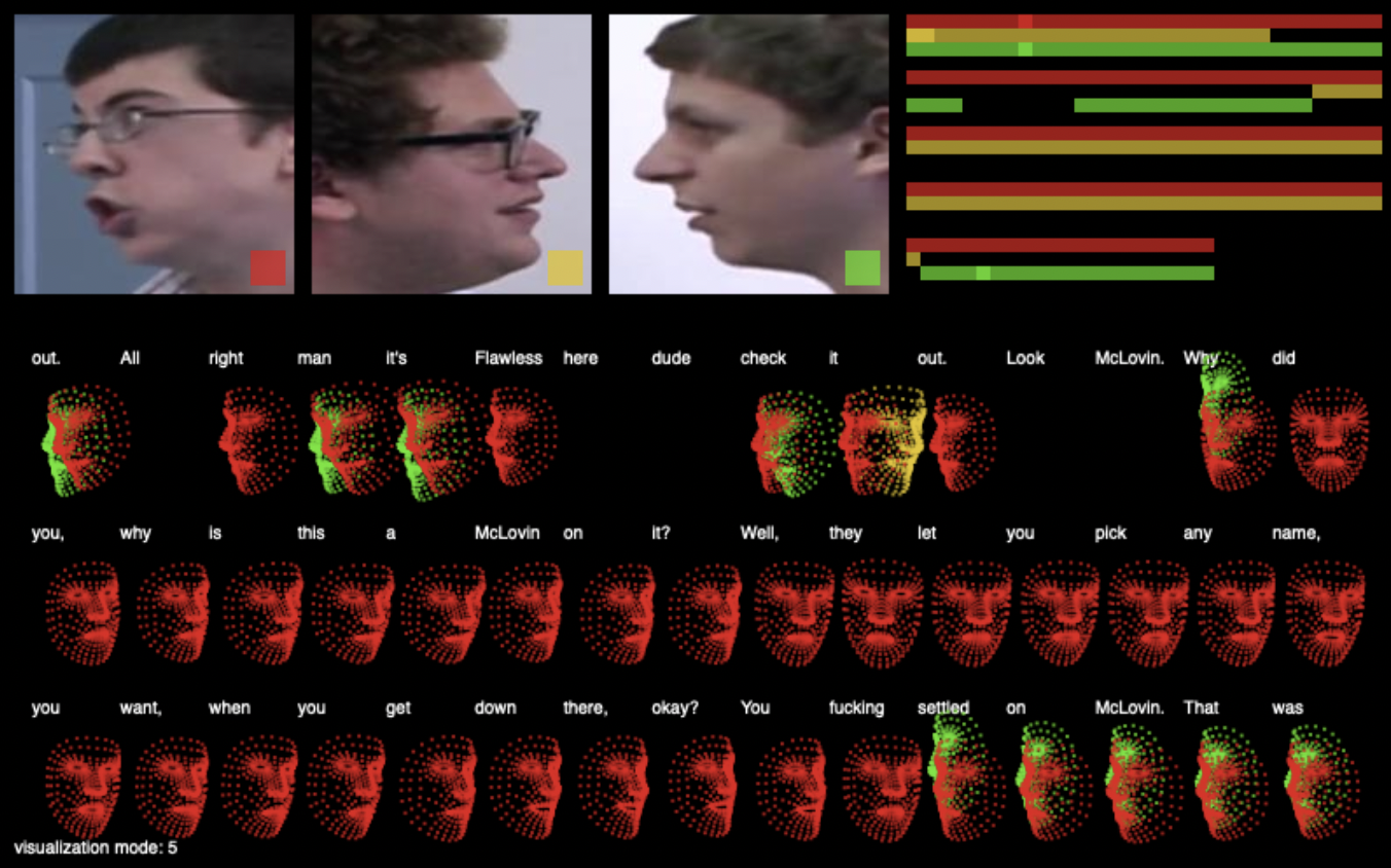
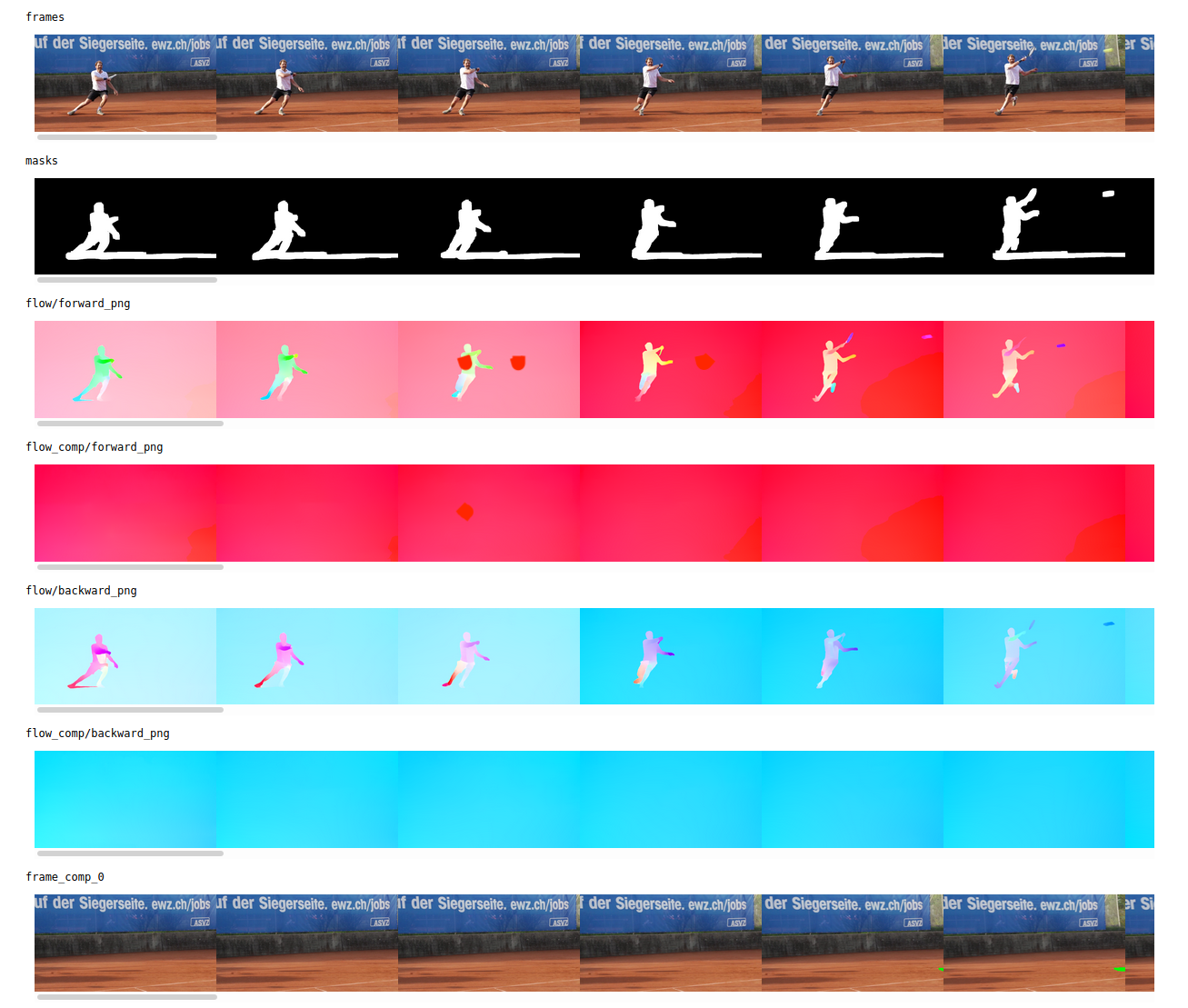
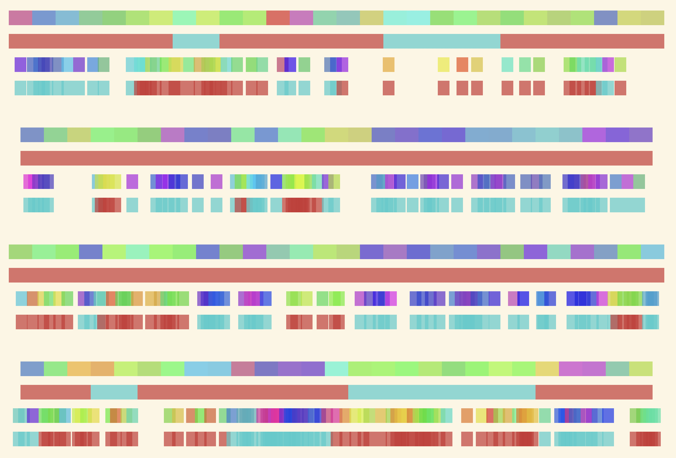
I was elated at the ease of inserting a <video> tag and having a scrubbable interface with a programmable API to attach my model predictions to. Beyond simple inspection, I went on to build mock versions of the full interaction flows. These visualizers were instrumental to validating that the machine learning outputs, more than automate an existing workflow, could function as primitives at a new level of abstraction. The interface functions as a "minimal proof of interaction" asking: can I wield this the way a Photoshop expert can wield images?
From a technical perspective, all of these interfaces are single HTML pages with interaction logic stuck inside <script> tags, forgoing any "best principles" regarding separating HTML, CSS, and Javascript. I slowly build up the pages, at first just <img src="local-path">, then some click handlers, then some inline styling. It's the ethos of html-energy, combining the minimalism of htmldom.dev programming with quick feedback loops, centered around seeing what a change does. No boilerplate, no frameworks, no server. Just an HTML file opened directly in the browser.
Swimming in one's filesystem
A surplus of hand-curated media files live on our file-systems. These are artifacts we care about enough to screenshot, save as PDF, or jot down in notes. Nonetheless, it's as if we've put them in deep-storage: it's hard to do anything with them, and even rarer to mix different artifacts into a collage. One is forced to embed images and text into inextricable word documents and slides, or use an infinite canvas like Figma, at which point the files are no longer individuated, instead mere parts of a single new file. The browser as media viewer can circumvent this.
Here's a trivial example, two dozen lines of code to bring a static library of PDFs to life, replicating the well-known feeling of splaying all of one's papers out on a desk in preparation for writing. It brings the digital filesystem closer to the feeling of entering a physical library. Let me see their covers, peruse the collection, leaf through the pages!
This reconsiders the files on one's computer, not as static assets with fixed ways of viewing, but as raw material to build with: archive bricolage. I use <embed> tags to render the PDFs and lower the activation energy by forgoing a server. The interface relies on the `drop` operation to grant the browser permission to read files. To share, just send over the `.html` or zip up a directory with the files. Best practices be damned. This is a home-cooked meal.
An infinite canvas for your filesystem
Compelled by the idea of archive bricolage, and having seen some demos of the Muse iPad app, and thought to make a pared down version in this raw HTML, vanilla JS style. Wrapping everything into an absolute positioned <div> with some mouse handlers gave me an infinite canvas. Expanding it with the drag-and-drop security loop-hole of the pdf-viewer, I got the demo below. Video, audio, text, image, and PDF co-existing in one space.
Since, I've been tweaking the affordances into a system I've nicknamed CS_Store. I was inspired by Omar's tweet on DS_Store, the infamous file ignored in everyone's Git. It was a little bit of metadata stored right there in the file-system, right next to the content it was describing. Each DS_Store holds information about the spatial layout of files in Finder. This felt like the epitome of local-first development hidden in plain sight.
the fact that everyone sees .DS_Store files as nuisances and not as precious, irreplaceable information (it's the file that remembers how I got my folder laid out just right!) shows how much Finder has failed to make graphical file management into a serious prospect
— Omar in Boston (@rsnous) May 11, 2020
CS_Store is an infinite canvas for your file-system, providing the two-dimensional, visual presence of the Desktop for any directory. The information about the layout is stored in a `.CS_Store`, this time in a human-readable JSON blob pointing to files in the same directory. Here's the source.
Having this system as a playground lets me try out some kooky interactions:
- Directory as scope: A CS_Store canvas corresponds to a single directory. Linking to other canvases is done by visually representing sub-directories and the parent directory, and allowing navigation like a file browser. Interestingly, this means that all data needed to view the canvas elsewhere can be packaged with a single .zip operation at the desired root.
- Sound regions: Audio files are automatically played whenever they are visible in the viewport. As you navigate the virtual landscape, they function as a soundtrack, setting the mood for what is to be seen or read.
- Viewport as context: When an element is added to the canvas, it's a fixed size relative to the viewport. To add a header, zoom out to the region that matters. To add a small comment, zoom in next to the image. The hunch is that one can establish an isomorphism between viewport and the context needed for interpreting an artifact.
Of course, the browser has clear failings: I could not easily e.g. make a PDF scroll sideways. The ladder of abstraction is not evenly spaced. Some steps require terrifying leaps into the Chromium codebase and, in fact, these interface boundaries have massive implications on the space of possible artifacts a system can produce. Beyond technical feasibility, a poorly designed API forecloses the imagination of the user to just a few steps beyond the starter code. What role do tools have in expanding that imagination?
How to build your own media environments
Since reading through Ken Isaacs' How to Build Your Own Living Environments and adapting his designs for a few desks at Reduct's space in Soft Surplus, I've been sold on the emancipatory power of DIY. I've always been motivated to make, however articulating the motivation through a sense of agency was revelatory. There's a subtle, yet political, transformation in which domains of the world cease to seem immutable. This sentiment has been reinforced as I've read Ivan Illich's works, who writes about convivial tooling: "[Tools] which give each person who uses them the greatest opportunity to enrich the environment with the fruits of his or her vision." [2]
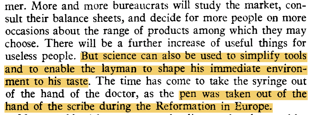
I've used the browser to exemplify the kinds of artifacts that should be simple to make, however the web is not HyperCard; you can't really make a home-cooked meal. Just thinking about explaining to a layman the client-server model, HTTP, CORS, URLs pointing to disk, JS syntax in an unstructured editor, &c, makes my head hurt. To make convivial tools in the current landscape of software is, as Rob Ochshorn put it, to be a parasite, clinging on to the "platform capitalism" of search, social media, and SaaS. We, the programmers, are the scribes of this world, who can misappropriate the platforms for our own ends. Our pen must be taken away.
The emphasis on materiality leads to a pedagogical aside. By focusing on an empirical ground truth, e.g. the state of an image on the screen, a student can grasp that declarative frameworks, drawing abstractions (`drawCircle`), or imperative access on arrays of data are simply paradigms to provide ergonomic access to something beneath. This insight implicitly teaches what a "good" abstraction is: it allows you to do work. This is in contrast to the approach I encountered at school, of function decomposition, or avoiding repeated work, which make the design of computer software seem like a neurotic chore.
For the layman to build their own Folk Interfaces, jigs to wield the media they care about, we must offer simple primitives. A designer in Blender thinks in terms of lighting, camera movements, and materials. An editor in Premiere, in sequences, transitions, titles, and colors. Critically, this is different from automating existing patterns, e.g. making it easy to create a website, simulate the visuals of film photography, or 3D-scan one's room. Instead, it's about building a playground in which those novel computational artifacts can be tinkered with and composed, via a grammar native to their own domain, to produce the fruits of the users' own vision.
The goal of the computational tool-maker then is not to teach the layman about recursion, abstraction, or composition, but to provide meaningful primitives (i.e. a system) with which the user can do real work. End-user programming is a red herring: We need to focus on materiality, what some disparage as mere "side effects." The goal is to enable others to feel the agency and power that comes when the world ceases to be immutable.
Cristóbal Sciutto, June 2022.
Thanks to Chris Beiser, Omar Rizwan, and Rob Ochshorn for their provocations and feedback.
[1] There's a consensus around some friends who work on ML for VFX that the quality of the data often matters more than the quantity. It's Karpathy's first step. ↩
[2] In contrast, Illich writes about the hubris of engineers aiming to get higher speeds of transportation, without realizing that they are usurping the commons into a highway with an entrance fee. I can't help but wonder if a similar process is happening with the software community's emphasis on frameworks and best practices, the industrial mode of production manifest in code. ↩